

What are you seeing?
The ’90s are back. The 1890s, that is. Turn of the century inspired typefaces (we’re calling them “Jugend-ish”) are suddenly everywhere, bringing an often overlooked era into a new light. The trend is named for the similarity of these contemporary typefaces to the fonts that emerged from the German art magazine Jugend and the Jugendstil movement, a close cousin to the Art Nouveau and Viennese Secession movements happening in Britain and Austria around the same time.
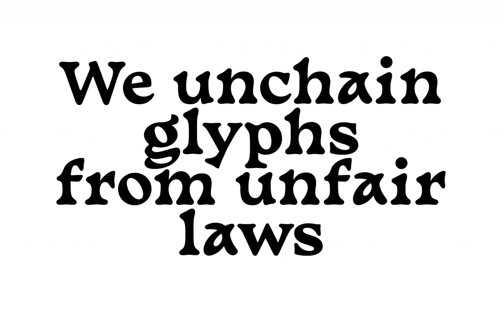
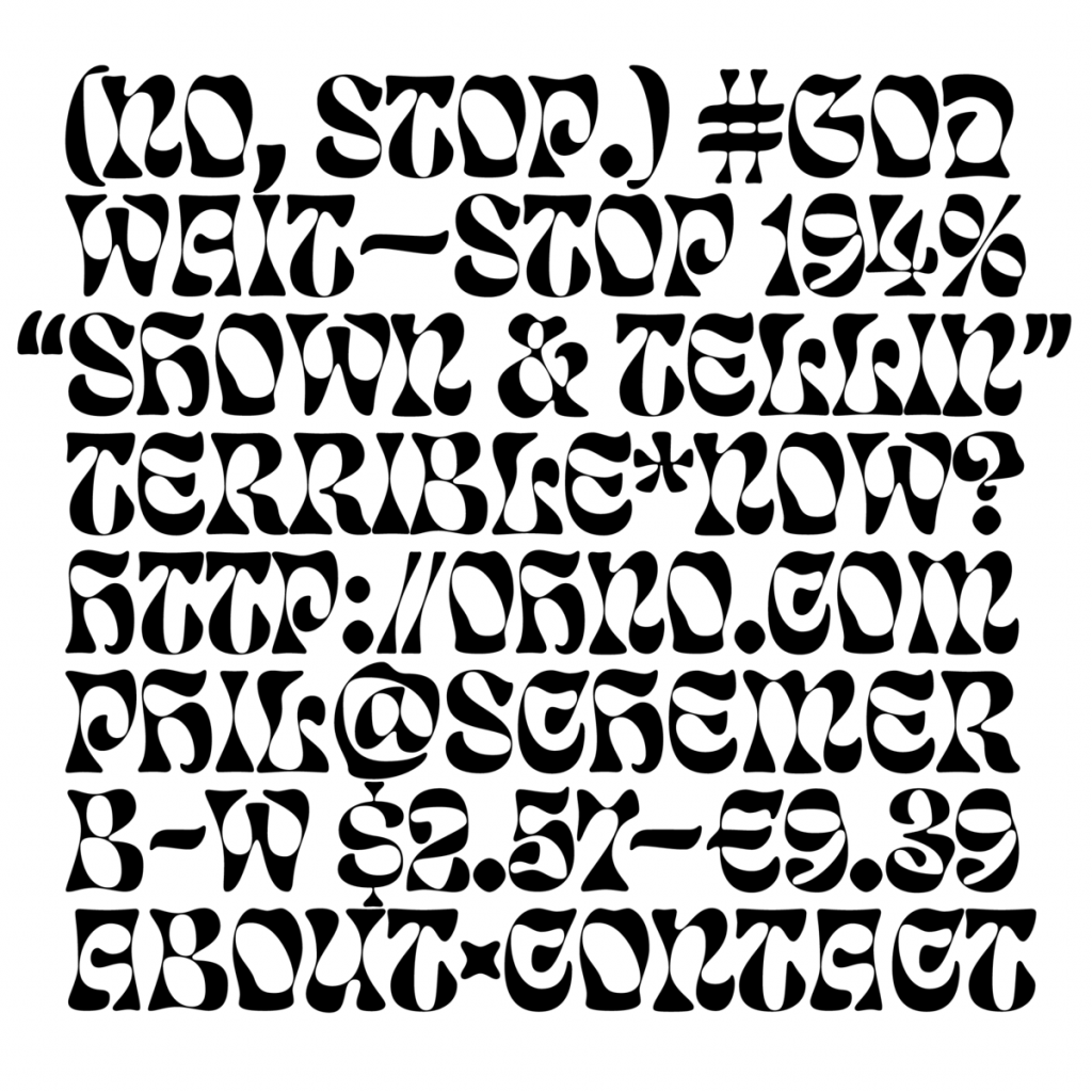
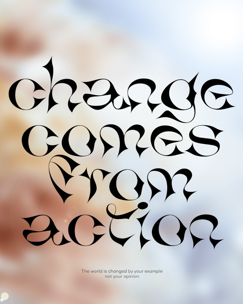
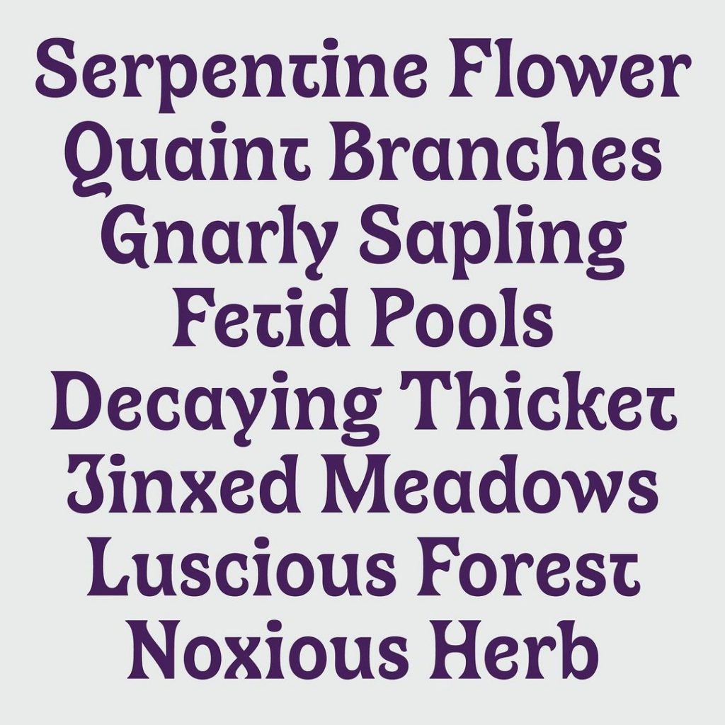
Jugend-ish typefaces are characterized by decorative ornaments, a mixture of curves and sharp corners, and forms inspired by nature. They are inherently contradictory, combining elegant high-contrast tapers with strange psychedelic blobs. Put more simply, they are weird for weird’s sake, but in the way only a typeface can be; breaking rules around conventions while still adhering to long-standing historical traditions of balance and symmetry.
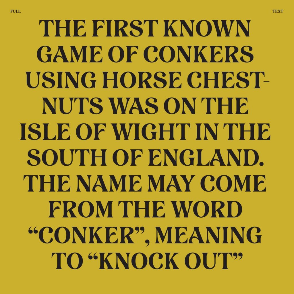
These Jugend-ish typefaces have been creeping up at the fringes of the design world over the last year, and in some ways could be seen as an evolution of rounded old-style faces like Cooper that have been dominating design since circa 2017 (see: Chobani’s now-ubiquitous rebrand, not to mention similar fonts in use for Great Jones, Poppi, Burger King, and Mailchimp). Cooper and Jugend-ish styles are both linked to type trends from the early 1900s, as well as to the resurgence of these trends again in the 1970s, but while chunky serifs prize boldness and legibility, Jugend-ish typefaces eschew clarity in favor of asynchronous decoration.

Who’s using it?
This trend is a slow-burner, and its edge-case legibility means that the vast number of current uses are in editorial design and other one-offs, rather than more complex identity systems. That said, while the trend isn’t trickling down into branding too much just yet, type designers seem to be especially keen on the style, which means that we can probably expect it to start popping up in many more applications over the next few months or years.
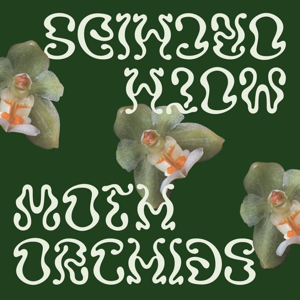

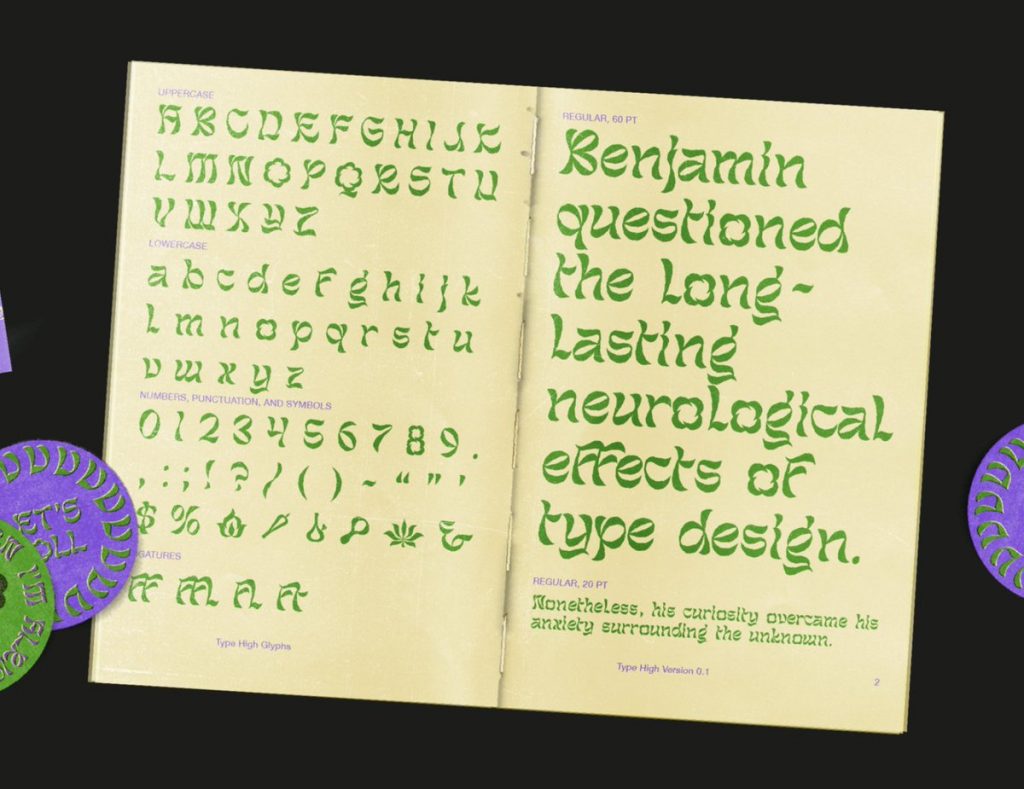
Some Jugend-ish display faces like Orkyd, Glyph World and the increasingly popular Eckmannpsych (a design rooted in Jugenstil era typeface Eckmann) are curvy and goopy, while others, like Monarch Nova and the recently released Lovechild, are more rigid with subtle curves interspersed more discerningly. Kaspar Pyndt’s forthcoming typeface Hieroglyf is another unique Jugend-ish entry, developed for use in an exhibit on the painters of Danish Symbolism at The National Gallery of Denmark, and inspired by a drawing tutorial-booklet owned by many of the painters included in the show which featured a distinctive Jugendstil masthead.
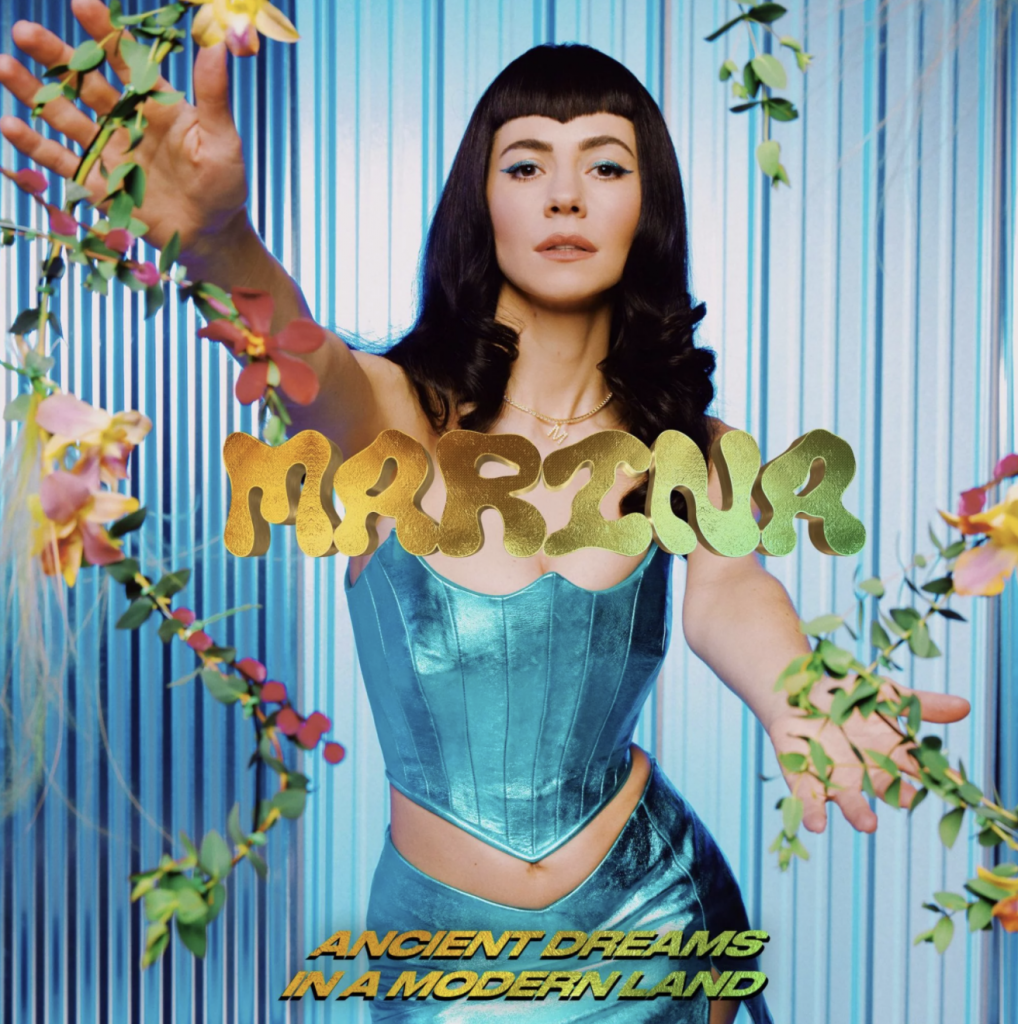
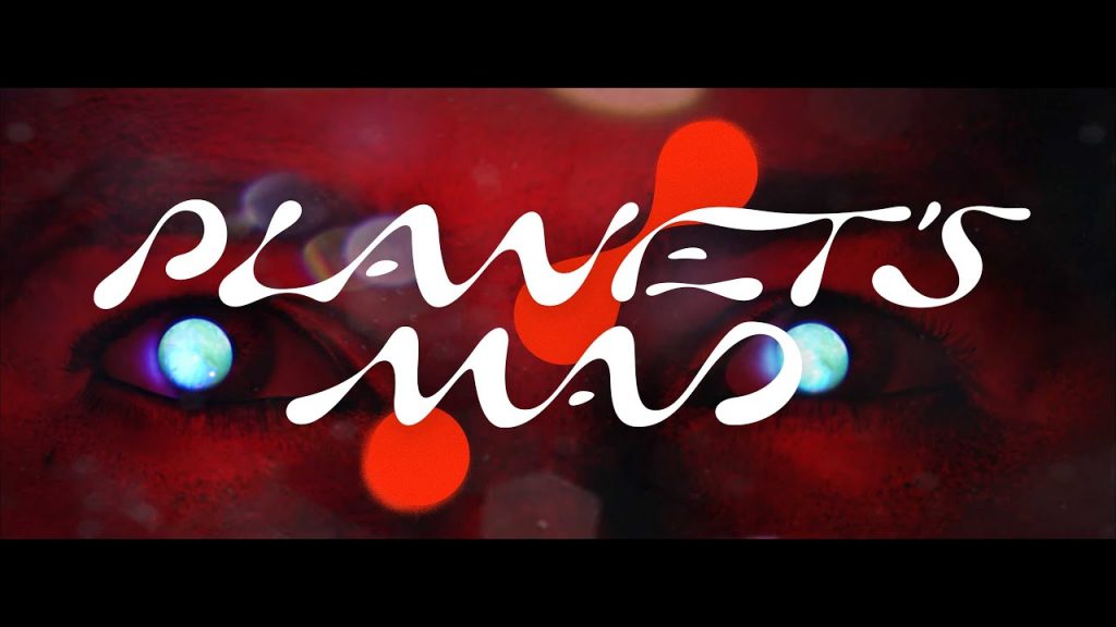
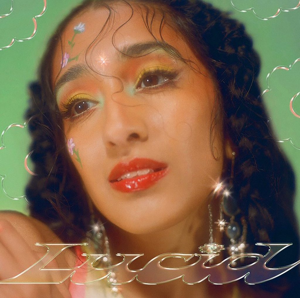
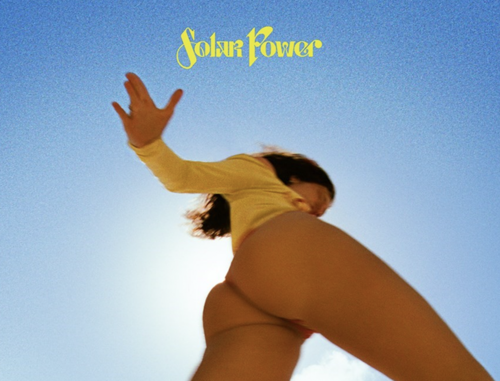
Outside of type design, Jugend-ish typefaces seem to be especially popular in the music world, where readability is secondary to vibes, and clearly written titles can feel redundant within streaming services that already list album information in an interface’s simple sans. A few examples from 2021 include Lorde’s Solar Power, Tinashe’s Pasadena, and Marina’s Ancient Dreams in a Modern Land.
Jugend-ish typefaces seem to be especially popular in the music world, where readability is secondary to vibes.

Why do designers love it?
To put it simply: everyone is sick of #blanding. Understated grotesks defined the early direct-to-consumer era, and designers are ready to inject more personality into their work. While chunky serifs were the initial response by those looking to combat 2010s Modernism, type designer Simon Walker believes that Jugend-ish faces have a “broader, more universal appeal than those ’70s-era rounded typefaces, which feel a bit more rooted in a specific time and place—one that we’re maybe setting aside for now.” From a technical standpoint, Jugend-ish typefaces also seem to be a perfect mid-point between the deadpan readability of simple sans and chubby serifs (you may recall that Comic Sans, not too dissimilar from Cooper, is adored by elementary teachers everywhere for young readers) and the more digital-unfriendly script logos of brands past. As screen resolution and consumer fluency with branding improve, it’s possible that there’s more support for typographic approaches that push boundaries, and contrast, a bit more.
Every reaction has an equal and opposite reaction, and in the case of design, the pendulum seems to swing between minimalist and maximalist, energetic and austere, tradition and anarchy. Stephen Coles, associate curator at Letterform Archive, emphasizes this constant ebb and flow between trends, pointing out that “Jugendstil was a reaction to industrialization, Psychedelic 1960s, a response to Swiss Modernism, and the current wave of Jugend-ish a response to every company changing their logo to a geometric sans.” Said another way, just as Gen-Z is back to posting true candids on Instagram, the design industry’s focus on restraint and commercial viability is giving way to an infatuation with personal style and authenticity.
Type designer Kasper Pyndt theorizes that this interest in typographic quirks may have even more philosophical roots for contemporary designers. “One could speculate that quirks—or ‘flaws’—function to question the traditions and conventions that have shaped type design in the 19th century,” he says. “This would mirror the current reckoning with lingual and behavioral norms in the world at large—what we’ve previously seen as ‘truth’ may not indeed be so.” It’s a good reminder that while the design world can seem insular, it’s just another reflective microcosm (at times a bit ahead of the curve) of the shifts happening in society at large. In the case of Jugend-ish typefaces and the impending post-Covid renaissance, our future seems likely to include both a look back to our history and the natural world as well as a look forward to a bold and futuristic approach to self expression.