
“So, what are you working on, Tim?”
It was the early ’90s, and the question was polite, run-of-the-mill banter at a friend’s dinner party.
“Some kid’s series,” Tim Jacobus replied. “You’ve probably never heard of it.”
And why should they have? Jacobus was a career book cover illustrator. Commissions came and went. No one was really expecting all that much from this particular launch; the publisher said they’d assign a couple covers to Jacobus, but promised they’d give him something else if it didn’t pan out.
“It’s called Goosebumps,” Jacobus offered.
Forks clattered to plates. “Are you kidding me?” the group asked.
“Kids—get up here with your books.”
And they did.
Previously, Jacobus had to stalk the shelves of stores for any given cover he had created. Soon enough, those same shops would have entire Goosebumps sections—and Jacobus’ work was suddenly the visual language for a publishing phenomenon that became the bestselling children’s series of all time, moving 4 million titles each month prior to J.K. Rowling claiming the crown.
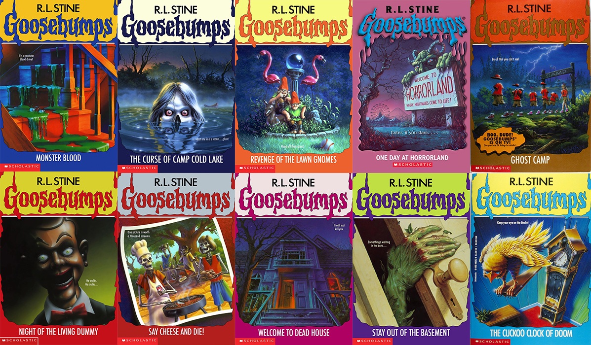
Thirty years later, the covers have proved their staying power. In fact, they’re so singular that while readers today may not remember the particulars of the series’ flagship entries, they can instantly recall the art that branded them. Such lightning on cover stock is impossible to orchestrate and predict in publishing, try as marketing departments might. It’s the product of a unique alchemy—but when it happens, the long tail of nostalgic power looms, decades on. The covers of Goosebumps proved to be uniquely of their moment while simultaneously defining it, the art becoming shortform for an era of Chuck Taylors and the devil-may-care mindset of ’90s youth at large.
“The fact that you and I are still talking about this is just mind-blowing,” Jacobus says from his home studio in New Jersey. “Absolutely mind-blowing.”


Long before the advent of branded Goosebumps fan clubs (shout out to Media Play), board games, TV series and films, as a kid Jacobus could be found drawing on large reams of paper alongside his father, who would bring the supplies home from his gig in the pharmaceutical industry. At the time, Jacobus thought nothing of his skills and assumed everyone knew how to draw.
In high school, fate would see him attending a commercial art class at a nearby vocational program. There, he discovered commercial art was in fact a career—and, well, “It was life-altering,” he marvels. He scuttled his plans to attend a traditional college, and enrolled at the portfolio-focused Spectrum Institute for the Advertising Arts.
At Spectrum, one of Jacobus’ teachers was a book cover illustrator, and the work immediately resonated. “Once I saw what he was doing, I was like, “yeah—that’s what I want to do.” Jacobus graduated in 1981, when all art was tangible. So when his teacher took him to his first meeting with an art director, high in the clouds of a Manhattan publisher, he was daunted by the piles of hand-painted work amassed in the office—“each one more mind-blowingly fantastic than the other.” The art director reviewed his work and told him to return with six to eight pieces correctly formatted as book covers, in the style of what he wanted to create moving forward.
Jacobus went home and scrapped all but a few pieces from his portfolio. And then, he passed on the opportunity to do mechanicals at his local newspaper, and instead took the hardest jobs he could find. On garbage trucks. At construction sites. Machine shops. Admirable jobs, to be sure—but not jobs he actually wanted to work. His thought process? “When I would get home at night, I would be motivated.” In his off hours, he punched time on his portfolio. Some of the earliest works he retained in his book offer a look into his stylings at the time; they’re highly detailed, and the less-abstract pieces boast a concrete sense of realism, even with the skull-topped airplanes soaring by the edge of the world.
Eventually, he was ready to return to the city, where publishers held “drop-off days” for illustrators to leave their work for consideration. Usually, it ended with a simple note: “thanks, but no thanks.” You’d then move your portfolio a block or two down the street to the next office, and go back to work. Rinse. Repeat—until you convince someone to take a chance on you.
For Jacobus, his break came in the form of William Duggan’s 1985 debut novel The Great Thirst. The subject matter is nothing familiar to Goosebumps readers—no Slappy, haunted masks, or any trappings of the macabre. The cover depicted a dying African watering hole where lions, zebras, and kudu coexist in their imbibing. Despite Jacobus’ comment that it’s not like any of his other artwork, the saturation, softness, use of light and sparkling water remain remarkably his own, a testament to his versatility.
“I had a million styles,” he says. “That was kind of why I stayed busy—you tell me what you want, and I think I can make it happen.”
So let’s talk about the style he is best known for—for better and, even for a time, worse.

Jacobus contends that he never knew the word “no.”
It was 1991, and he had been working with Scholastic on projects for a couple of years. He had no idea who R.L. Stine was, though the author had already developed a solid reputation with his Fear Street series. The publisher offered Jacobus and illustrator Jim Thiesen each a cover to audition them for Stine’s veritable Twilight Zone for young readers. On the whole, Jacobus says Scholastic was lukewarm on the series and was concerned it wouldn’t take off—and Stine was worried about spreading himself too thin.
“It wasn’t like, ‘oh, this is going to be a big deal,’” Jacobus recalls. “Nothing like that. It was like, ‘it’s going to be a couple of books.’”
Jacobus was assigned Goosebumps #1, Welcome to Dead House. He got a whole chapter as background—a bit of a luxury, given the paragraph descriptions he’d later work off of from Stine, who would come up with the titles for the books, paradoxically, before the actual manuscripts. Welcome to Dead House was written as Stine eased himself into the series—and took a more straightforward horror approach than the lighthearted leanings the series would become known for. In his cover, Jacobus followed that thread, delivering a more restrained cover than his subsequent output. Notably, he began by dropping the perspective to the floor—a hallmark of his eventual cover paradigm.
“I really liked doing that worm’s eye view thing where basically, you’re on the ground looking up, and that makes everything big and looming and intimidating,” he says. “Kids are little, and the whole world is intimidating, so that played into it.”
For the Scholastic team, the devil was in the details. The house looks dead, yes—but also viscerally alive in the uneasiest of ways, from the half-open door and figure lurking in the window to the vein-like branches of the tree.
For his cover to Stay Out of the Basement, Jim Thiesen—who came from a more typical horror book cover background, having designed jackets for Stephen King and others—delivered a classic: a “realistic” monster hand emerging from the depths below, the creases of its knuckles, the nuances of its fingernails detailed in their rendering, down to the somewhat nauseating palette. Jacobus says the editors looked at Thiesen’s cover and his own, and came to a conclusion: “We can’t scare the crap out of kids.” If readers had nightmares, parents would no longer buy the books.
Jacobus had deferred to color theory and utilized a more saturated palette to take the edge off. He was a fan of the Brothers Hildebrandt, known for their Tolkien work and rich mastery of colors; he loved that when their imagery dipped into shadows, it didn’t just go dark—it would evolve into blues and purples. In Jacobus’ cover, the frights were implied, rather than presented outright.
“I liked Tim’s art right from the start,” R.L. Stine says. “No one had ever done a horror book series for kids 7 to 12 before, and I thought Tim captured just the right level of scariness for the age group. We didn’t really want to terrify kids—but we did want to excite them with our covers.”
Jacobus got an offer to do the next few books in the series.
“I was like, ‘Wow—I don’t have to sweat,” he recalls. “We’re paying rent for a little while. This is good.”
The second assignment, Say Cheese and Die, would go on to cement not just his place in the series, but its signature tone. At that point, the series concept became utterly clear to Jacobus, and his work formed a symbiosis with Stine’s, breaking new ground for the category in the process. “I was most happy that his covers captured the humor of the stories as well as the horror,” Stine says. “It’s one thing to be scary—but it’s much harder to be funny at the same time.”
“We didn’t really want to terrify kids—but we did want to excite them with our covers.”

In their own way, Jacobus’ classic Goosebumps covers are like bugs in amber—a record of illustrated book cover production at the end of the century, as the mechanical vaulted toward the digital.
All told, each cover took Jacobus around 35 hours to produce. The format was always square, on a 20-by-20–inch canvas, sans the iconic Goosebumps logo (which had been created in-house at Scholastic). Jacobus usually produced around three 8-by-10 sketches for each cover, before developing a color study, and turning to his acrylic-based paints and an airbrush on a slightly textured #80 illustration boards for the final.
With Goosebumps on a monthly release schedule, the work was steady—but also demanding, if not unforgiving, with no room for haggling over creative direction. And that’s the way Jacobus liked it.
“That was a real help from the artistic side, because we couldn’t fool around,” he says. “People couldn’t get bogged down with, ‘Oh, let’s change this.’ … ‘You know what I would like to see here …?’ It was like, tick, tick, tick. It was rapid fire.”
And the quicker the books came, the less information he got from Stine, often working off just a short blurb about the plot—which imbued the project with an element of creative freedom all its own. After all, Jacobus notes, he wasn’t drawing the same characters over and over as many illustrators do for a series. Each book meant a fresh subject and a new scenario. “If I couldn’t come up with an idea under those conditions, I shouldn’t be doing this for a job.”
Sometimes, Jacobus would feature characters from the book in his work—and in those instances, he had a budget from the publisher to commission artistic models for the covers (yes, it was a niche industry). He could go through the agent’s books and select a model, or tell them what he needed for a particular image—and the kids had to be capable of acting to some degree, to at least look animated or scared enough for the cover brief. (It’s worth mentioning that the models weren’t always pros, though—sometimes, a family member made it to the cover, as his niece did for The Haunted Mask.)
As time went on, the covers evolved as Jacobus took his signature floor-level perspective and began to warp its dimensions in Escher-like ways, giving the covers a dream-like quality and a reduced sense of reality, where he could push concepts even further.
Of course, there were limits. As he notes in The Art of Goosebumps, which came out in November, blood was green—not red. No kids got injured. No kids died. There were no weapons, save for the exception of the executioner’s ax in A Night in Terror Tower. (In fact, the series’ nostalgic draw today is perhaps partly due to the fact that there’s a particular innocence to the plots and subsequent imagery on the covers—coming immediately before 9/11 redefined the world for many.)
Ultimately, Jacobus says he only ever had to make one significant change to a painting at the publisher’s request: On the cover of Revenge of the Lawn Gnomes, Jacobus had featured one of the title characters picking its nose. “At the last minute, somebody said, ‘I don’t want to hear any blowback from teachers or moms or parents. Let’s just change it.’”
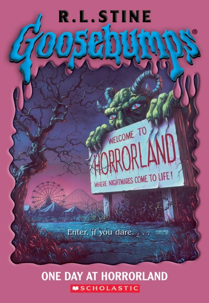
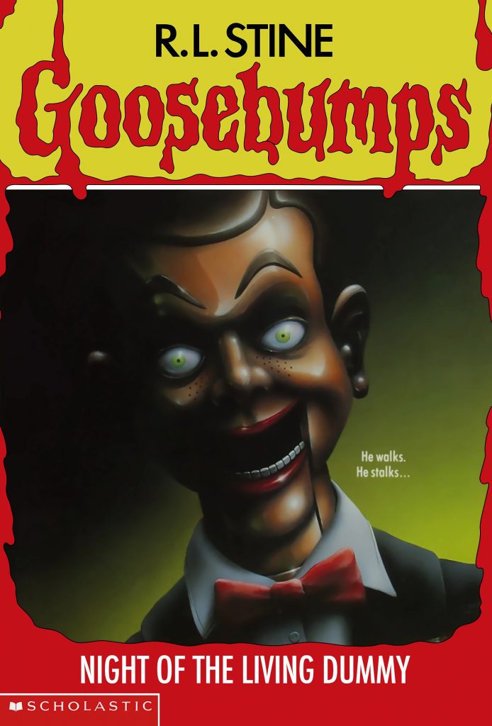
So he did. After all, Scholastic outright owned all rights to the work, and they paid Jacobus extra for the privilege of doing so. Which hasn’t made archiving any easier. The Haunted Mask, Night of the Living Dummy, A Day at Horrorland … where do the most famous Goosebumps paintings reside today?
For years, Jacobus believed a rumor that they had been destroyed in a Scholastic warehouse during Hurricane Sandy. He then heard that someone had spotted some of the paintings in a storage closet. Today, Jacobus says, a half dozen of some of the heavy hitters are apparently framed in Scholastic’s lobby in Manhattan.
“I haven’t seen them since the day I finished, the day I packaged them up and handed them out the door,” he says. “I have copies. I have reproductions. But it would be nice to sit with the kids for a couple of hours.”

For a decade-plus, Jacobus’ life and career was all things Goosebumps. Until it suddenly wasn’t.
He had completed the trippy cover for The Incredible Shrinking Fifth Grader … but was told to hold off on turning it in. Over the years he had heard about contractual disputes between Stine’s camp and Scholastic’s, and had assumed everything would be fine. It wasn’t.
“I knew it could happen, but it doesn’t suck until it sucks,” Jacobus says.
In early 2000, Scholastic failed to renew Stine’s contract, and Goosebumps was suddenly over. Simple as that. Jacobus’ final cover would remain on ice until he released it online nearly 20 years later.
Back then, Jacobus had become the “Goosebumps guy”—no doubt a complicated pill to swallow for an illustrator who prided himself on his stylistic versatility before the advent of the series. He doesn’t know if he actively lost jobs by being pigeonholed, but overnight his status of working on the blockbuster series became a detriment.
Simultaneously, an era was in transition. The glory days of the ’90s mass market paperback era were coming to an end; with the dawn of the internet and other advances, entertainment was evolving.
“You ride this thing,” he says. “This is the wave. We stay on the wave all the way until it crashes on the beach. Then, at that point, you pull yourself out of the surf and decide what you’re going to do next.”
Jacobus realized he couldn’t sustain a full-time career in book cover illustration any more.
Not dissimilar from how he wound up with his Goosebumps career, he took what was supposed to be a two-week job at the corporate learning shop DScape Interactive in 2003, and that’s where he works to this day, serving as a creative director and interactive motion graphics designer, skills he picked up after the series ended.
But that doesn’t mean he has fully left that life behind—in addition to DScape, “there’s an illustration on the board at all times.” (He gets up every day at 4 a.m. to work on his art pieces and commissions.) Eventually, he reached a point in the 2000s where everyone had more or less forgotten about Goosebumps. “It’s a story that I tell, but nobody really gave a shit anymore.”
Until they did. Owing to the cyclical nature of such phenomena, on its 30th anniversary, Goosebumps nostalgia is very much alive and in full swing. And Jacobus is getting a fair amount of jobs because of it. “You guys are all grown up now, and you’re art directors, and almost every job I do now starts with, ‘When I was a kid, I used to read Goosebumps,’” he says.
Like many kids, I voraciously consumed Goosebumps books, and pored over Jacobus’ artwork, seared into mind and memory, without ever knowing his name. And that is design. Thirty years and 100 Goosebumps covers later, I—and so many others who grew up on their creatively influential stylings—finally do, and he has earned his due.
Sometimes, in the best of cases, that, too, is design.