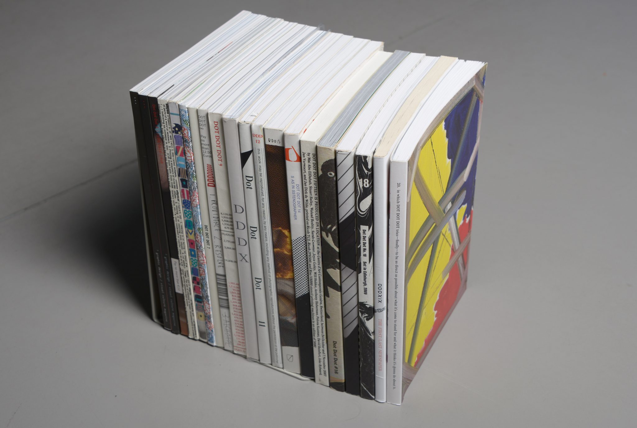

“Why another graphic design magazine?” asked the cover of the first issue of Dot Dot Dot, published in April 2000. “The pilot issue hopes to answer itself, being an encyclopedia of previous attempts.” And so begins this new magazine founded by graphic designers Peter Bil’ak, Stuart Bertollotti-Bailey, and Jürgen X. Albrecht. A quasi-meta analysis of design magazines and publishing, the issue includes critical analysis of Emigre and Hard Werken, an interview with Rick Poynor of Eye, a conversation with the editors of Typografische Monatsblätter, and even an alphabetized encyclopedia of 20th century graphic design periodicals. “In compiling these pieces we hoped to syphon off some wisdom and help plot our next move,” the editors write in the introduction. This rigorous meta-analysis immediately inserted Dot Dot Dot into the lineage of design journalism and set the tone for its entire run of 20 issues which were released biannually from 2000 to 2010.
In 2005, Poynor described Dot Dot Dot as “the most stimulating and original visual culture magazine produced by designers since Emigre’s heyday in the late 1980s to the mid-1990s.” Certainly, if you were a particular type of designer in the early 2000s, Dot Dot Dot was the most exciting publication you could find. Yet unlike Emigre, the popular design magazine published by Rudy Vanderlans and Zuzana Licko through the ’90s, Dot Dot Dot was much harder to define. To try to describe it is to describe a series of contradictions: it was both high brow and humorous, exclusive and accessible, over-designed and under-designed, self-serious and self-deprecating, neither academic nor trade journal, and—as Bertollotti-Bailey said to me—“both invested in graphic design and dismissive of graphic design.” (A French publication once described its design with another contradiction: “carefully contrived flippancy.”) Moreover, to call Dot Dot Dot a ‘graphic design magazine’ is both reductive and inaccurate. Over the course of its life, it published unique and idiosyncratic stories, expanding the original design focus out into film, music, literature, and art. Despite only printing 3000 copies of each issue and ending its run a decade ago, the ethos that drove the magazine, both editorially and aesthetically, continues to influence vast sections of the design landscape. Dot Dot Dot is, perhaps, the most influential design publication you’ve never heard of.


Launched while Bil’ak was a student, Dot Dot Dot hoped to fill a gap he saw in how design was discussed. “On one side you had portfolio magazines where you looked at work and the text was just some captions. Then you had magazines like Visual Language that were very theoretical and academic but uninterested in anything else,” Bil’ak told me. “We hoped there could be a way where practitioners could discuss the theoretical and tangential things that weren’t directly connected to your practice instead of just talking about production and printing techniques.” In retrospect, Dot Dot Dot launched at a peculiar time for media, and especially design media—caught in the transition from a print dominated media system to a digital one. It sat in between the explosion of design writing during the ’90s, when publications like Emigre and Eye offered a future of rich design criticism and the weblogs of the late 2000s like Design Observer and Speak Up, a prelude to our current social media-driven world.
The first few issues did focus squarely on graphic design, with stories about typographic history, interviews with designers and essays by Bil’ak and Bailey along with people like Paul Elliman, Michael Rock, Daniel Eatock, Daniel van der Velden, and Robin Kinross (while later issues did expand the pool of writers, the first few issues predominantly featured men). The writing was both intellectually rigorous and formally daring, falling between academic writing and trendspotting. As the editors wrote in the first issue: “We want our magazine to be both read and looked at,” before noting the writers of each piece designed their own spreads, marrying form and content from the outset. The first few issues featured longform essays on historical figures like typographer Anthony Froshaug and the fictional Swiss designer Ernst Bettler, critical analysis of ephemeral fliers and the influence of technology, and meditations on contemporary design practice.
“I remember thinking I really want to publish this but it’s not about graphic design. Then I thought, why not? Maybe this is what a graphic design magazine has become.”
But by the fifth issue, as Bailey and Bil’ak got more confident (Albrecht left after the first issue), the journal’s scope started to expand. “There was one moment for me that changed how I thought about it,” Bertollotti-Bailey told me, pinpointing this moment to when they published an essay in the fifth issue by Experimental Jetset called The Beatles/Stones Dialectic. “I remember thinking I really want to publish this but it’s not about graphic design. Then I thought, why not? Maybe this is what a graphic design magazine has become,” he told me. “This was strangely liberating and from there all hell broke loose!” With a newfound freedom, Dot Dot Dot became more of a visual culture magazine, with stories on music and movies, language and literature, all while retaining its experimental and rigorous DNA. As design writer Emily King would later put it: it wasn’t a magazine about graphic design but a magazine from graphic design.
In 2006, as Bi’lak’s attention turned from the magazine to other projects, Bertollotti-Bailey moved to New York to be the first ‘designer-in-residence’ at O-R-G, the hybrid art project and design studio founded by David Reinfurt that over the years has shifted between traditional design studio, artistic platform, and software company. “My latest scheme for O-R-G was to turn it into a residency for designers,” Reinfurt said. “And I was already talking to Stuart and had written for the magazine so I asked him to be the first resident.” Reinfurt and Bailey began working closer together and over the next few issues joined as co-editor, working with Bailey under the name Dexter Sinister.


Dot Dot Dot’s approach to graphic design often gets categorized as ‘critical design’—a term Bailey rejects in the final issue. Not to be confused with the more popular usage coined by Anthony Dunne and Fiona Raby, who saw product and industrial design as a tool for critiquing new technologies, Dot Dot Dot’s flavor of critical design explicitly sees graphic design, in itself, as a critical activity. In the 2007 book and exhibition Forms of Inquiry: The Architecture of Critical Graphic Design, Zak Kyes and Mark Owens (another DDD contributor), note the distinction in their curatorial statement, including work “that is motivated by a shared impulse to reframe the circumstances surrounding contemporary graphic practice by using modes of investigation to probe the boundaries of the discipline.” The exhibition featured Bertolotti-Bailey and Reinfurt along with many DDD contributors like van der Velden, Pesko, Will Holder, and James Goggin.
As Francisco Laranjo noted in Modes of Criticism, the rise of critical design marked a shift from ’90s-era ‘designer as author’ to the more expansive ‘designer as researcher.’ This, perhaps, explains Dot Dot Dot’s move from a magazine about graphic design to one from graphic design — graphic design becomes a lens through which to understand and interrogate adjacent aspects of culture. Laranjo cites Werkplaats Typographie, the Dutch graduate program founded by Karel Martens where Bertolloti-Bailey was a student, and Yale’s MFA program, where Reinfurt was a student, as sources for a way of thinking that use design as a starting point to generate new discourses. A subtext that can be read in the writing of many of these designers is a frustration—and perhaps disaffection—with graphic design as it is traditionally practiced. The key, however, is that this frustration results not in an abandonment of the profession but rather is channeled towards a belief that graphic design can exist outside a traditional client-designer model, becoming a mode of cultural production.
A subtext that can be read in the writing of many of these designers is a frustration—and perhaps disaffection—with graphic design as it is traditionally practiced.
Yet as the writing got more ambitious, both in form and content, including longer personal essays, epistles, and experimental structures, the design itself became more structured. The aesthetic of the first few issues vary wildly from ’90s-era experimentation and a more restrained, classic aesthetic. The editors commissioned a custom typeface called Mitim by Radim Pesko and developed a template that every article would be placed in from issues 11 to 20. “Instead of redesigning every issue,” Bertollotti-Bailey told me. “We’d just do a two column grid, two type sizes, and all the issues would be exactly the same.” The last ten issues were pioneering in what’s now often referred to as “default aesthetics” — though this was before the term gained prominence and I bet the editors would reject the label — where you introduce as few design elements as possible, using instead of the default settings in the software. (Today, this is perhaps most often seen in the recent Brutalist website trend.)
If this is the DNA of Dot Dot Dot, then the journal’s influence can be found across the contemporary design landscape. Jon Sueda and Emmett Byrne’s short-lived Task Newsletter, for example, used “design as a perspective, designed objects as evidence of larger systems, and designers as researchers” and featured a few DDD writers (including Reinfurt himself). Indie magazines like Feeeels and Talk, both produced by graphic designers, continue Dot Dot Dot’s editorial ethos in their own ways. Independent design and art publishers like Occasional Papers, co-founded by graphic designer Sara de Bondt, or booksellers like Chicago’s INGA Books also use graphic design as a venue to explore wider cultural topics. Are.na, the social bookmarking site, is popular among research-focused designers. (And I’ve seen more than a handful of memes about the futility of graphic design spreading across the site.) Are.na publishes their own blog and an annual printed publication that, with its literary contributions and default-design style, feels like a distributed, 2021 version of Dot Dot Dot. (Reinfurt designed the cover for the first Are.na annual.)


Then there are the publications all three editors would go on to do post-Dot Dot Dot. After ending Dot Dot Dot in 2010, Bertollotti-Bailey and Reinfurt have been running The Bulletins of the Serving Library with Angie Keefer and Francesca Bertollotti-Bailey. The Serving Library is a non-profit institution that publishes PDFs on their website, all using the same template, very much continuing the ethos that drove the last DDD issues, and compiles them into printed annuals. Works That Work, Bil’ak’s next magazine that published ten issues between 2013 and 2017, was described as ‘magazine of unexpected creativity,’ and much like Dot Dot Dot, forced the reader to rethink their own definitions of design. Inverting Dot Dot Dot’s framework, Works That Work felt like a magazine about design for people outside design. “One of the fundamental assertions of Works That Work is that creativity is not the exclusive domain of artists or designers,” Bil’ak wrote in his introductory essay. “But something that surrounds us in our daily lives, something so embedded in our everyday experience that it often escapes our attention.” Both of these publications can be read as a response to what they were trying to do with Dot Dot Dot. Both work to not only expand the voices included on their pages, but also move beyond the tight-knit graphic design readership that dominated Dot Dot Dot — WtW moving towards a more general readership and The Serving Library closer to a fine art space.
Bricks from the Kiln, a small journal published by Andrew Lister and Matthew Stuart is perhaps Dot Dot Dot’s most obvious spiritual successor. Lister and Stuart are both graphic designers, previous DDD writers have contributed to the magazine, and it’s hard to describe Bricks from the Kiln as a graphic design publication, despite its editors’ backgrounds. In their first four issues, they’ve experimented with works about sound and live performance, art, and linguistics. “We take typography and language very seriously, and I think that’s the throughline between Dot Dot Dot and Bricks,” Lister told me. “So we pull from concrete poetry, literary theory, film, and other things.” Like DDD, Bricks from the Kiln encourages experimental and self-reflexive writing and is interested in publishing pieces that’d be hard to find a home elsewhere, somewhere between general and academic writing. “We discovered Dot Dot Dot in college,” Stuart added. “It showed us another way of considering the world as a graphic designer, not necessarily through design but design as a segue into other subjects.”
The critic and novelist Matthew Stadler has written about how publications create their own publics, that acts of publishing create a space for people to congregate around. “There is no preexisting public,” Stadler writes. “The public is created through the circulation of texts, discussions and gathering in physical space.” The Dot Dot Dot approach comes from a longer history of design practice — through Werkplaats and Yale, from designers like Richard Hollis and Paul Elliman — and will continue into the future. But through publishing, Bil’ak, Bailey, and Reinfurt created a public: a space for like-minded designers to come together. The public did not turn inward but outward, inviting more people in, making these ideas more accessible and providing a template for the next generation. For those who frequently get disenchanted with graphic design — and god knows I’ve felt that — Dot Dot Dot showed us an alternative. This is perhaps why its legacy, at this point a decade after it ceased production, has outlasted its own life. “Even though Dot Dot Dot was sort of exclusive and sometimes hard to find, everyone involved was giving public presentations and publishing elsewhere, furthering that Dot Dot Dot ethos,” Rob Giampietro, another frequent contributor told me. “And that’s the best expression of Dot Dot Dot becoming more inclusive.”